What is Responsive Web Design and Why Does It Matter?
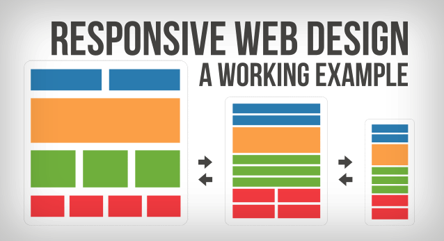
Responsive Web Design is an approach to web development that ensures a website's layout and content adapt seamlessly across various devices and screen sizes. By utilizing flexible grids and layouts, along with scalable images and media queries, websites can provide an optimal viewing experience for users on smartphones, tablets, and desktops alike. This technique not only enhances usability but also improves accessibility, making sure that all visitors, regardless of their device, can navigate and interact with the content effectively.
The importance of Responsive Web Design cannot be overstated in today's digital landscape. With a significant percentage of web traffic coming from mobile devices, websites that do not employ responsive design risk alienating a large portion of their audience. Moreover, search engines like Google prioritize mobile-friendly websites in their rankings, which means that a responsive design can significantly impact your site's SEO performance. In short, implementing responsive design is essential for businesses seeking to enhance user experience, boost engagement, and improve their visibility online.
5 Key Benefits of Implementing Responsive Web Design
Implementing responsive web design offers numerous advantages, with the foremost being enhanced user experience. A responsive website adjusts its layout based on the size of the screen, ensuring that visitors enjoy a seamless experience whether they are using a desktop, tablet, or smartphone. This adaptability reduces the need for horizontal scrolling and zooming, making navigation smoother and more intuitive. Consequently, users are more likely to stay on your site longer, leading to lower bounce rates and improved engagement.
Another significant benefit of responsive web design is its positive impact on search engine optimization (SEO). Search engines like Google prioritize websites that provide a consistent user experience across all devices. By implementing a responsive approach, you can simplify URL management, as there is only one version of your site. This facilitates easier indexing and improves your chances of ranking higher in search results. In summary, adopting responsive web design not only enhances user experience but also boosts your site's visibility on search engines.
How to Optimize Your Website for All Devices: A Step-by-Step Guide
In today's digital landscape, optimizing your website for all devices is crucial to ensuring a seamless user experience. Start by implementing responsive web design, which allows your website to adapt to varying screen sizes, from desktops to smartphones. You can achieve this using flexible grids and layouts, coupled with CSS media queries that adjust your design based on the user's device. Additionally, test your website on different devices and browsers to identify any layout or functionality issues that may arise.
Next, prioritize mobile optimization in terms of speed and performance. Use tools like Google's PageSpeed Insights to analyze your site's load times and discover opportunities for improvement. Consider optimizing images, leveraging browser caching, and minimizing JavaScript to enhance performance on mobile devices. Lastly, ensure that your website's navigation is intuitive and user-friendly, with large, clickable buttons and easily accessible menus, promoting a positive experience for visitors no matter which device they are using.