The Impact of Typography on User Experience: Why Every Font Matters
Typography plays a critical role in shaping the user experience on digital platforms. The choice of font can significantly influence how content is perceived and understood by readers. For instance, a well-chosen font can enhance readability and comprehension, while an inappropriate typeface can lead to confusion or frustration. Factors such as font size, weight, and style all contribute to the overall aesthetic and functionality of a website or application. As such, designers must carefully consider how different fonts evoke emotional responses and maintain consistency in style to foster a positive interaction with users.
Moreover, the impact of typography extends beyond mere readability; it also affects user engagement and action. When users encounter text that is visually appealing and easy to read, they are more likely to stay longer on a site and engage with its content. For example, a study may reveal that websites using modern, sans-serif fonts tend to keep users’ attention better than those that utilize outdated or overly decorative fonts. In summation, selecting the right typography is not just about aesthetics; it is about creating an optimal environment for users that encourages interaction and fosters a lasting relationship with the content.
5 Typography Mistakes That Could Be Costing You Conversions
When it comes to web design, typography plays a crucial role in shaping user experience and influencing conversions. One of the most common typography mistakes is using too many fonts on a single page. This can create visual clutter and confuse visitors, leading them to disengage rather than convert. Ideally, you should limit your font usage to two or three complementary fonts. This not only enhances readability but also establishes a cohesive brand identity that can help retain visitor interest.
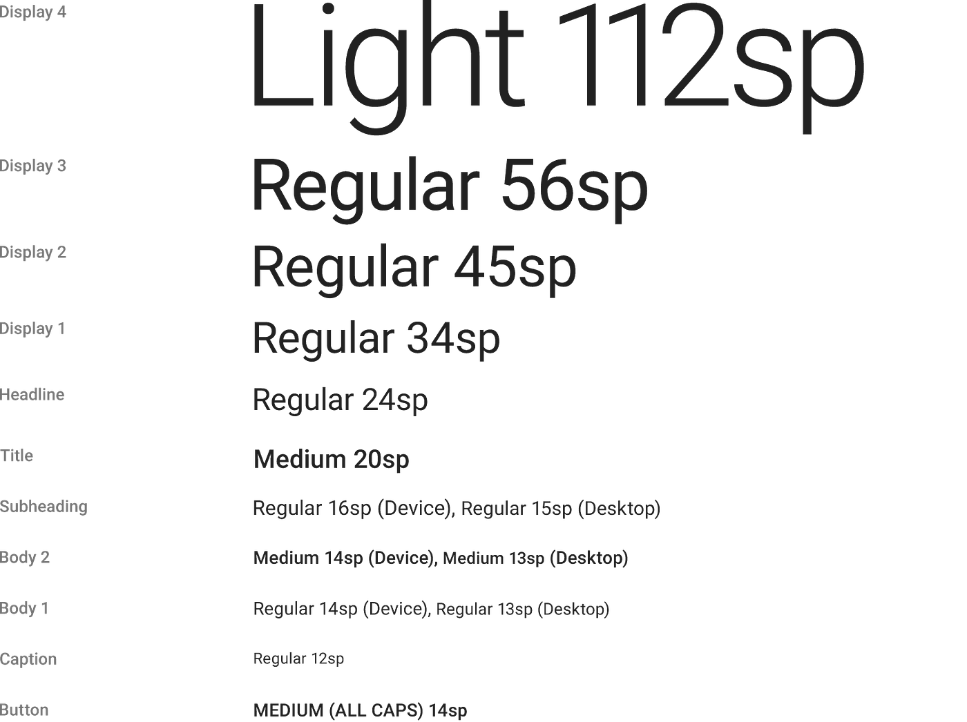
Another critical oversight is neglecting the importance of font size and hierarchy. If your website features overly small font sizes, users may struggle to read your content, prompting them to leave your site prematurely. To address this, ensure that your headings stand out with larger font sizes and clear contrast. Implementing an effective typographic hierarchy by using different sizes and weights can guide users seamlessly through your content, making it easier for them to follow and ultimately increasing the likelihood of conversions.
How to Choose the Right Typeface for Your Brand Identity
Choosing the right typeface for your brand identity is a crucial step in establishing a memorable presence. The typeface you select communicates your brand's personality, values, and tone. Start by identifying your brand's core attributes; is it modern and edgy or classic and sophisticated? This understanding will help narrow down your options. Consider how different typefaces evoke emotions and perceptions. For example, a sans-serif font may convey a contemporary feel, while a serif font often suggests tradition and reliability.
Once you've determined the style that best represents your brand, it's important to test your chosen typeface in various contexts. Utilize typeface pairing techniques to create a harmonious visual hierarchy. You might want to combine a bold headline font with a more understated body text. Additionally, ensure that your selected typefaces are versatile for different mediums, from digital platforms to print materials. Finally, always keep your target audience in mind; the right typeface should resonate with them and enhance your overall brand experience.