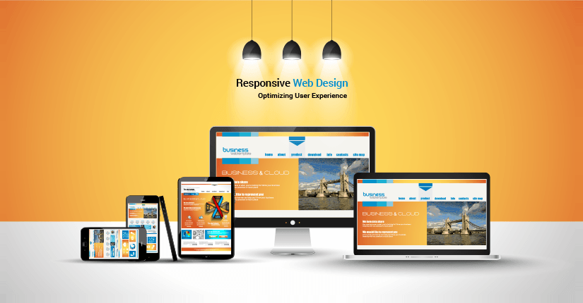
Understanding the Principles of Responsive Web Design
Responsive Web Design (RWD) is a modern approach to web design aimed at creating websites that provide optimal viewing experiences across a wide range of devices. This design philosophy emphasizes the importance of flexibility in layout, images, and media queries to ensure that users can easily navigate and interact with a website, regardless of the screen size. A well-implemented responsive design not only enhances user experience but also positively impacts SEO rankings, as search engines favor mobile-friendly sites.
Key principles of responsive web design include fluid grids, flexible images, and media queries. Fluid grids allow for dynamic resizing of website elements based on the screen dimensions, ensuring that the layout adapts smoothly to various devices. Flexible images maintain their aspect ratios while scaling, preventing distortion and enhancing visual appeal. Lastly, media queries empower developers to apply different styling rules based on device characteristics such as width, height, and orientation. By understanding and implementing these principles, designers can create websites that are not only aesthetically pleasing but also functional and user-friendly.
Top Techniques for Creating Flexible and Adaptive Layouts
Creating flexible and adaptive layouts is essential in today’s web design landscape, where user experience is paramount. One of the top techniques for achieving this is through the use of css flexible box layout (also known as Flexbox). This layout model allows designers to arrange elements in a way that can adapt to various screen sizes and orientations. By setting properties like flex-direction, justify-content, and align-items, you can create versatile designs that respond smoothly to changes in the viewport, ensuring that your content remains aesthetically pleasing and functional.
Another important method for achieving adaptive layouts is the implementation of media queries. These CSS techniques allow you to apply different styling rules based on device characteristics such as screen width, height, and resolution. For example, you can define a set of styles specifically for mobile devices to ensure that your layout is optimized for smaller screens. In practice, combining Flexbox with media queries creates a robust approach for developing layouts that not only look good but also provide an excellent user experience across a wide range of devices. To illustrate, consider the following example:
@media (max-width: 768px) {.container {flex-direction: column;}}
How to Test Your Website Across Different Devices and Screen Sizes
Testing your website across different devices and screen sizes is crucial for ensuring an optimal user experience. Start by utilizing responsive design testing tools. These tools allow you to simulate various screen sizes right from your desktop. Popular options include browser developer tools, which let you inspect elements and adjust the display. You can also consider using online platforms like BrowserStack or LambdaTest, which provide real device testing. Don’t forget to check the content layout, navigation ease, and load times on different devices, especially on mobile phones and tablets.
Once you have your initial test set up, it’s essential to perform a thorough assessment of the user interface (UI) across devices. Create a checklist of key elements to evaluate, such as typography, button sizes, and image responsiveness. Additionally, consider conducting real user testing by involving people with various devices to gain diverse feedback. This holistic approach not only helps in identifying issues that automated tools might miss but also enhances your website’s overall performance. When done regularly, device testing can significantly improve SEO rankings by optimizing your website for mobile-first indexing.