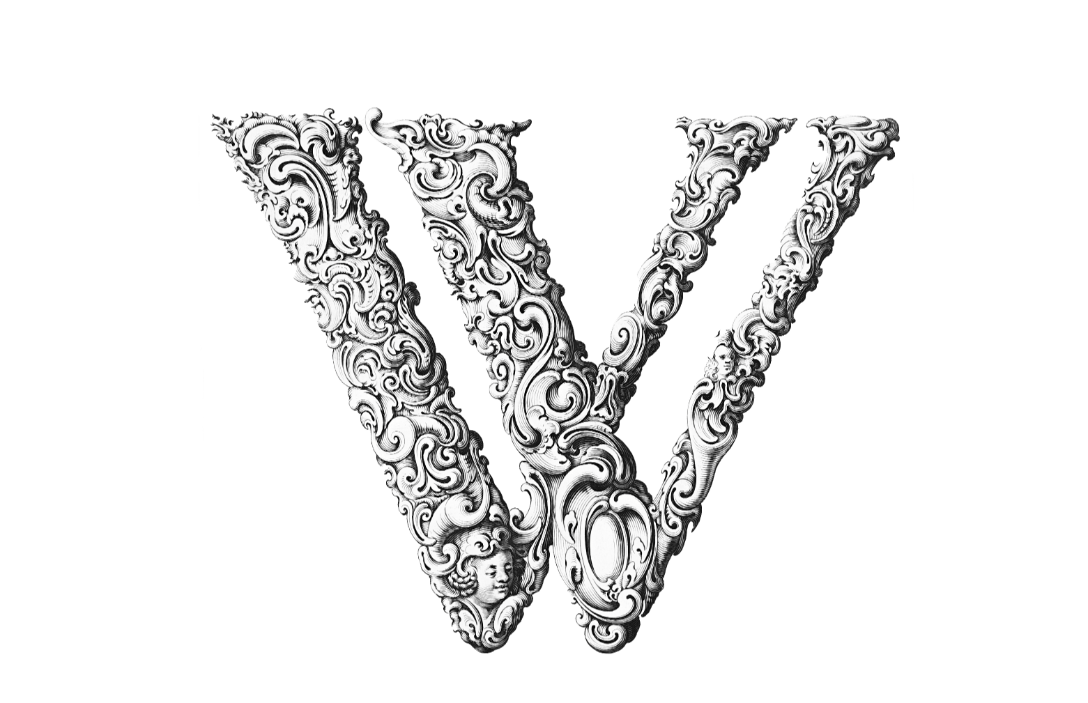
The Art of Typography: How to Choose Fonts That Enhance Your Message
Typography plays a critical role in how your content is received by readers, making it essential to choose fonts that effectively convey your message. The right font can enhance readability, create a mood, and ensure that your audience engages with your content. To start, consider the characteristics of different font families; for instance, serif fonts are often seen as more traditional and trustworthy, while sans-serif fonts offer a clean and modern aesthetic. Additionally, it’s important to maintain a visual hierarchy by using various font sizes and weights, ensuring your key messages stand out.
When selecting a font, look for options that reflect your brand identity and resonate with your target audience. Utilize tools like Google Fonts or Font Pair to explore a plethora of typefaces. Furthermore, consistency is key; limit yourself to two or three font styles in your design to create a cohesive aesthetic. Lastly, test your chosen fonts across different devices and browsers to guarantee accessibility and readability, as a well-chosen typography not only improves the user experience but also strengthens your message significantly.
Typography Essentials: Key Principles for Creating Engaging Text
Typography plays a crucial role in web design, making it essential for creating engaging text. Key principles of typography encompass various elements such as font selection, size, line height, and letter spacing. These aspects work together to enhance readability and maintain user interest. For instance, choosing the right font can set the tone of your content, making it more accessible and enjoyable for readers. Furthermore, maintaining a proper line height and letter spacing ensures that your text is not only aesthetically pleasing but also easy to digest. By mastering these fundamentals, you can significantly improve the engagement of your written material.
Another vital aspect of typography is the use of hierarchy to guide readers through your content. Implementing a clear visual hierarchy can be achieved through the effective use of headings, subheadings, and bullets. This structure allows readers to quickly identify key information and navigate your text seamlessly. In addition, employing contrasting fonts and sizes helps distinguish important information, reinforcing the key principles of engagement. Remember, the ultimate goal of typography is not just to beautify your text but also to enhance the reader's experience, making them more likely to stay on your page.
How Typography Impacts User Experience: A Deep Dive into Design Choices
Typography plays a crucial role in shaping User Experience, often acting as the first point of interaction between users and content. The choice of fonts, sizes, and spacing can significantly influence how information is perceived and understood. For instance, research has shown that readers prefer clean and legible fonts that enhance readability. Additionally, the effective use of hierarchy in typography—through variations in size, weight, and color—helps guide users' attention, making it easier for them to navigate the flow of content and engage with the information presented.
Furthermore, typography contributes to the overall visual identity of a website, influencing not just readability but also the emotional tone of the experience. Choosing the right typeface can evoke feelings of trustworthiness, creativity, or modernity. According to Nielsen Norman Group, inconsistent typography can lead to confusion and frustration for users. Therefore, maintaining a cohesive typographic system across a site not only enhances understanding but also fosters a stronger connection with the audience, ultimately improving the overall design experience.
